Search This Blog

Sunday, October 23, 2016

Electric Caresses curated by Diana Buckley


ELECTRIC CARESSES Curated by Diana Buckley
October 1 — 23, 2016
Joe Ballweg / Paul DeMuro
Margaux Ogden / Erika Ranee
Hosted by Deborah Brown, 324 Ten Eyck St, Brooklyn, NY 11206

Brooklyn, New York—Electric Caresses is a group exhibition featuring works by Joe Ballweg, Paul DeMuro, Margaux Ogden and Erika Ranee. In conjunction with Bushwick Open Studios from Oct. 1-2, 2016, and three weekends to follow, this exhibit explores highly nuanced electrifying imagery through large format paintings by artists that evoke an ability to speak to the present through electrifying metaphors. A contained and perhaps non-electric image can be obvious—(like an old still life found in a second hand store), and it can be subtle—(like a dusty portrait of a child painted in a flat mat hue). Yet the art of our time, as viewed in this exhibit, yields to re-contextualizing and re-framing our pragmatic use of things and the way we enliven them.


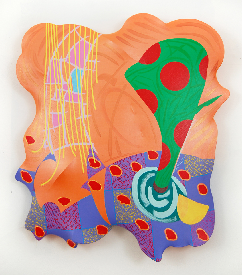
Joe Ballweg’s intellectual arsenal contains more scintillating image-data than an average person holds. His inquisitive and quirky formation is precisely painted and positioned around spackled multi color hues that he hand-mixes prior. These flamboyant colors allude to a digital 1980’s Gen X era, flowing elegantly amidst a masculine composition—this is a common trait found in Ballweg’s works. He produces, also, such images through developing sketches of the composition in his sketchbook, which shows an organized progression of one idea. By drawing varying stages of ideas, the method helps to avoid the risk of losing the concept entirely as it is transferred onto a significantly larger surface.


Paul DeMuro is inspired by a plethora of artists, from Judy Chicago to Georges Seurat. His massive 91 x 112 inch painting fixates the viewer through repetition of hand held mirrors. The encompassing diamond shaped vortex painted on the outer layer alludes to a pulsation, perhaps a base-heavy beat heard in trip-hop. Both Ballweg and DeMuro’s paintings alternate between an electrifying-metaphor that shares commonalities with their counterparts, Ogden and Ranee in this exhibit.


Margaux Ogden paints and writes directly on unprimed canvas reflecting an immediate and vulnerable intimacy.  Her text is drawn from everyday life referencing relationships, confessions, literature, jokes, numerical equations, observations and occasional nonsense. The resulting tone is reflected, or negated, by her sensuous color palette.


Erika Ranee is an urban archivist. She builds paintings layered with visual freestyle in the form of Energy-Tags. She collects discarded memorabilia – like magazine images of hip hop moguls, old hole-ridden sleep shirts, and snippets of conversations from eavesdropping ventures on the street, the bus, car or train. These urban artifacts are subsequently added to the mix and embedded in a metallic, viscous preserve of paint and shellac. Her painting is an exercise in pushing paint around to articulate a contemporary time capsule on canvas.


Diana Buckley is an independent curator based in Williamsburg, NY, working primarily with contemporary artists throughout the five boroughs. She earned her BFA with an emphasis in Art History Theory and Criticism from the School of the Art Institute of Chicago, and an MA in Art Administration from the University of New Orleans. She is the Director of Advancement for ProjectArt.org, a nation-wide social impact organization working to provide free access to arts education and studio space for emerging artists. Her curated group exhibitions include, I am What I am Not Yet, A Survey of Brooklyn's Moment, Madelyn Jordon Fine Art, 2015; The Space Between, Paul Kolker Collection, 2014; Schiller and Dream within a Dream New Century Artists, 2014; Shrink It Pink It, 80 Artists, Cathouse FUNeral Gallery, 2014; Persona, Colleen Asper and Amy Beecher, 7 Dunham, 2013; and It's Really Normaling, Brian Belott and Eric Hibit, The Greenwich House, 2013, among others.

Storefront Ten Eyck, the location of this exhibition, is located at 324 Ten Eyck St. in the heart of the Bushwick art community and is a former contemporary art gallery started by artist Deborah Brown to show the work of emerging Bushwick artists and to revisit the work of established artists. Since 2016, the gallery is transitioning wholly to Deborah Brown’s artist studio, and designated for select shows. Deborah Brown is a Bushwick artist, curator, arts activist and board member of NURTUREart, BRIC Artist Advisory Council and Community Board #4 in Bushwick. 

Sunday, November 29, 2015

Color Play: Studio Visit with Eric Hibit

Upon a long-awaited trip to India, and more trips to follow this fall, Eric and I were diligent to pencil in our studio visit. A few years ago at the Greenwich House I co-curated Eric's works into It’s Really Normaling, a two-person exhibit also featuring Brian Belott’s reverse glass. The Eric and Brian combo was insanely alluring! Both styles symbolized a resurgence against the over intellectualization of art, and fictitious descriptions in the exhibit synopsis added humor to the conversation.

Eric’s relationship to the art he creates remains consistent and magnanimous! He has been making it a point since his days at Yale School of Art to push the appreciation of beauty upon his audience. During our visit he said that in western tradition artists have been too focused on stripping down and de-aestheticizing.  With that thought, I was elated to place boundaries aside and negate a concept-first mentality. Viewing a work of art this way is antithetical to trends in contemporary curating; but still, a big part of the process is organizing works based only on aesthetics.  Artist, Jamian Juliano Villani's recent post on Facebook really resonated with me, I can’t decide what’s worse “decorative” or “conceptual”.  Yet despite my need to genre-bend up and back all that I see, Eric’s vision provided me with a pleasant pause.  While conversing with him I had ample head space to admire works of ordinary ideas truly rooted in imagery.  

The image above is of Eric's Studio. In the upper row, he started a new ink series. Far left: a chair inspired by the Shakers. In an artist lecture at The Maryland Institute of Art, Eric provided examples of non-western painting and how it plays an important role in his own life and beliefs. Patterns by William Morris (arts and crafts movement) and Japanese paintings and culture were Eric’s highlights that comprised examples of high craft and superb, hypnotic patterns. These artists were concerned with, and sought value in, a plain-speaking image that succeeded in underlying modes of fantasy in their message.

Eric has a plethora of these precious paintings stored in archival boxes!


Eric Hibit, Bobby Socks and Bowling Shoes, 2015, acrylic on paper, 14 x 17 in
Through his ability to curate bold colors and faint textural surfaces, Eric makes my top list of artists who are exceptionally aware of color. In a way his uncanny focus on color reminds me of German born American artist, Joseph Albers. Albers is famous for the Homage to the Square, and taught “handicrafts” and color theory at the Bauhaus. In his book, Interaction of Color (on my nightstand!) he states that "our concern is the interaction of color; that is, seeing what happens between the colors. As a consequence, this proves for the reading of color what Kandinsky often demanded for the reading of art: what counts is not the what but the how." I am obliged to Eric for providing the gift of color to our generation of artists.

Eric resides in Ridgewood, Brooklyn. Nearby in Gowanus, he is involved in Ortega y Gesset Projects, an artist-run curatorial collective where he recently curated Color Against Color. Of late, Eric is placing emphasis on color in his curatorial projects too, which crosses over with his own work. Fruit Bowl Abundance speaks for itself, below.


Eric Hibit, Punk Chick (DETAIL), 2015, acrylic on paper 14 x 17 in
All of his paintings are derived from free style drawing. The process of sketching a lucid pattern, (note the varied contours of the ear) to find a befitting shape is imperative to Eric’s stylized outcome. In Punk Chic, (a painting we admired for a long time in his studio), Eric informed that he carefully planned each of the facial features. To achieve a perfect appearance of blush for his subject’s cheekbones, Eric utilized printed fake fur and acrylic paint.

Eric Hibit, Punk Chick, 2015, acrylic on paper 14 x 17 in
Mask with Serpent, acrylic and abalone shell on paper
For millennia masks and snakes have had an imminent role in cultures around the world. For this painting, he made a paper stencil (left) to use for shaping his image. He affiliates it to Noh masks. Noh is a major form of classical Japanese musical drama from the 14th century. This amazing Mask with Serpent has actual abalone shell inlay with an emphasis on turquoise. I think that when Eric decides to use these mediums as inlays – (some of his works even feature glowing highlights) – he invites his audience into a world of experiential fantasy. I haven’t had the chance to see a Noh play, however after reading about it and seeing this work, I’m curious. This dynamic, the-more-that-I-look-at-it-the-more-I love-it painting has an entrancing effect on the viewer and evokes notions of mysticism and subculture. During our visit Eric noted that his work imbues sensuality not in a sexual way, but rather he is going for visual harmonies.

As an addendum to Mask with Serpent, I’m inclined to show Tulip Fields, below. It features a hot tulip amidst three Dutch windmills. What I would like the viewer to take away from Eric’s paintings in this review is an appreciation for his ability to imagine what seems unimaginable, nota bene, a: the red strokes on the tulip, b: the shade of the green leaf, c: the direction of the windmills, and d: the retro-esque pattern that he designed to further position such features - hello mama!

Tulip Fields, 2015, acrylic on paper, 17 x 14 in
Eric in his studio showing me his process with the intricate paper stencils he makes
In Buddha Hand with Flower, Eric made a stencil of the mudra, Mudrakhyam. A William Morris-like pattern of paisley defined in yellow against the light blue background was planned with the black stencil to the right of the painting. As Eric generously explained his process in developing these images, he said that the time it takes to prepare a work is equally important as the outcome of work itself. During my recent trip to India, we stumbled upon a small museum in Kochi, Kerala that had an exhibit of the history of mudras and expressive gestures as performed in what is called Thullal. I thought of this painting when I viewed the exhibit (and thereafter during a Kathakali performance, where the performer brought alive verses through expressive gestures). While utilizing gesture and the mudra, humor and satire were hallmarks of this mind-boggling tradition. In a lot of Eric’s works, one can easily find humor, too.

Eric’s works on paper are smaller in scale (17 x 14 in) than his armature paintings (the biggest: 69 x 55 x 10 in - recent sizes: 28 x 31 x 4 in). But despite their intimacy in scale, his subjects truly embrace the viewer—if you’ve read this far, it’s assumed you agree! 


Left: Homage a Braque, 2009, 69, 59, 10 in
Right: Brownout at Midnight, 2013, acrylic, wire, fabric, resin, wood (both), 46 x 52 x 7 in 

Circling back to the latter part of 2013, another exhibit that I curated Eric’s works into was called Solstice Synergy (a few other exhibiting artists included, Tom Smith, Osamu Kobayashi, and Tom Costa). It was such an honor to include two of Eric’s most complicated armature works, left and right above, and it wasn’t easy getting them to the gallery. In 2015, Eric has begun to make these armatures more flat (left and right below), while still keeping some depth apparent (about 4” worth). I was excited to be one of the first to see this new addition to his portfolio! The way that he constructs them is as follows: first he makes a wire construction of the curved shapes that he wants, securing them to a square wooden frame, then he folds canvas/cloth over the formed wire along with the application of resin to keep the overall hollow construction firm. Finally, he applies gesso and paints the surface. The time he spends on designing such magnificent work will make William Morris and Joseph Albers turn in their grave. -Diana Buckley
Eric Hibit, Dancing Hexagons, 2015, 28 x 34 x 4 in


Right: Still life with Pucker, 2015, (see the depth of these new armatures with this candid photo)


Eric Hibit, Still Life with Pucker, 2015, acrylic, wire, fabric, resin, wood, 29 x 32 x 3.5 in
Eric in his studio posing in front of two newest armature works, 2015

What counts here—first and last—is not so-called knowledge of so-called facts, but vision — seeing. Seeing here implies Schauen (as in Weltansvhauung) and is coupled with fantasy, with imagination
-Joseph Albers

visit erichibitstudio.com